Velocity & Scale Series


Define Your Scope Design System Intake >> (form)


Section name: The Essential

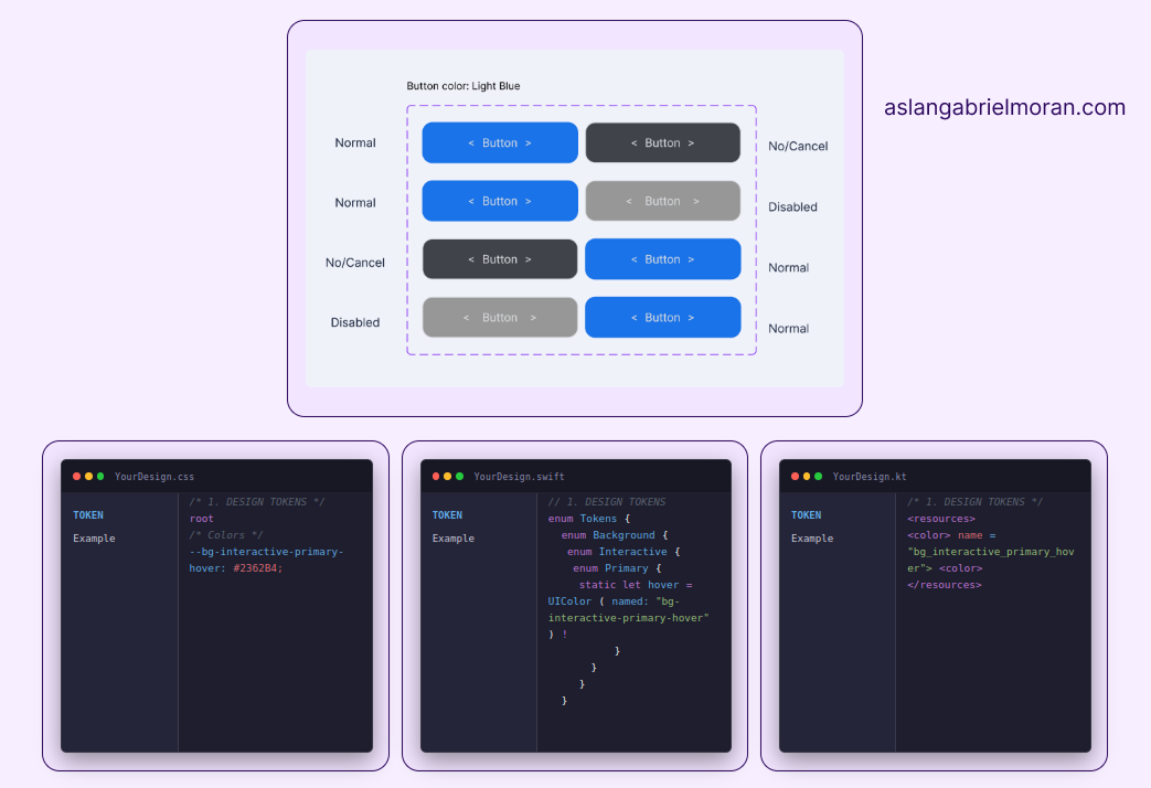
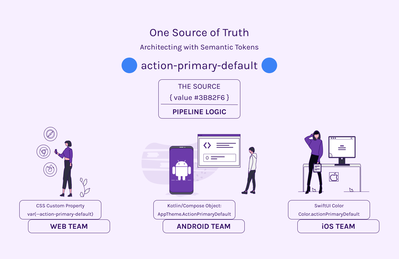
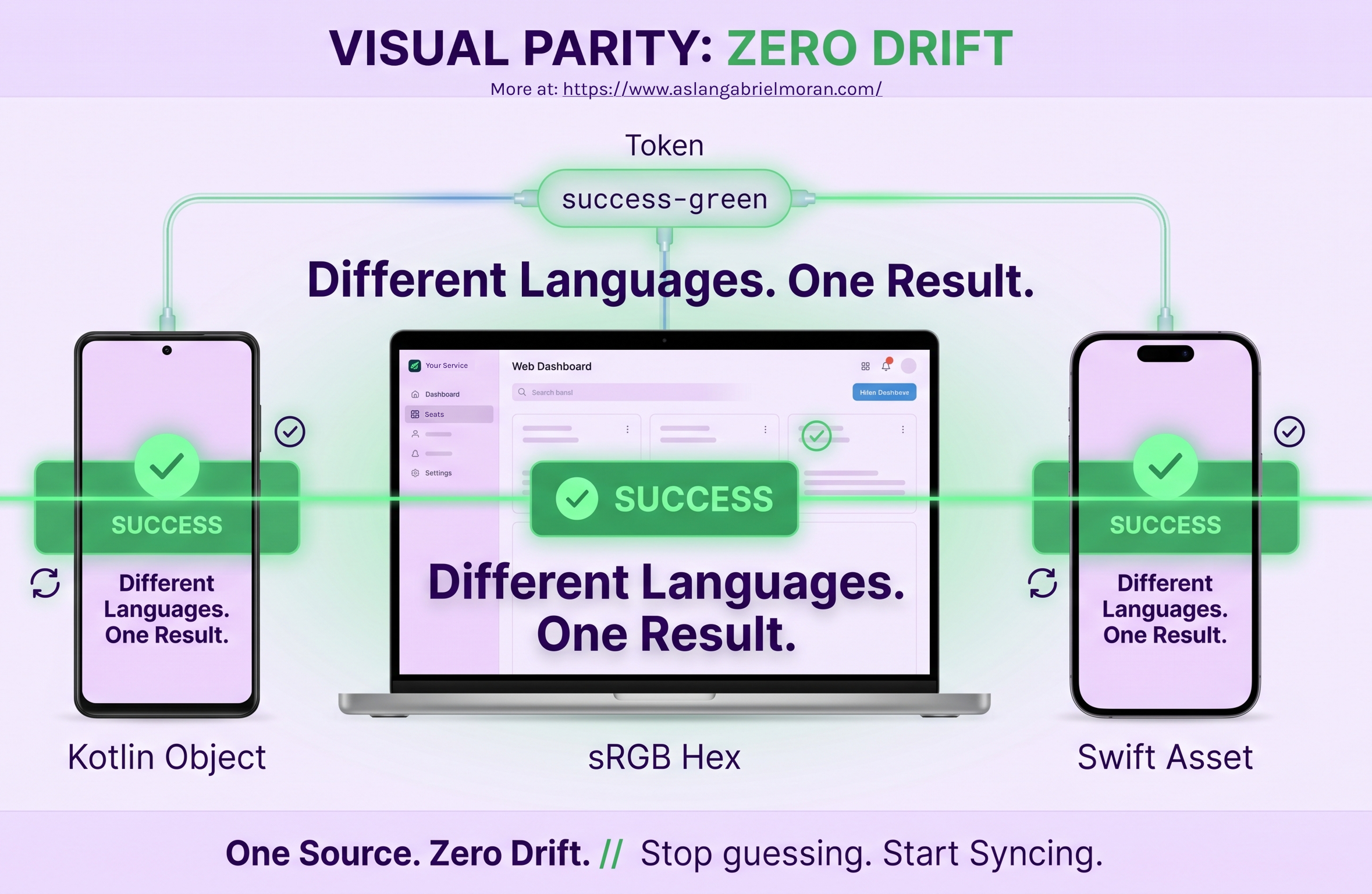
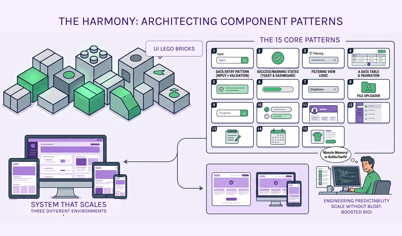
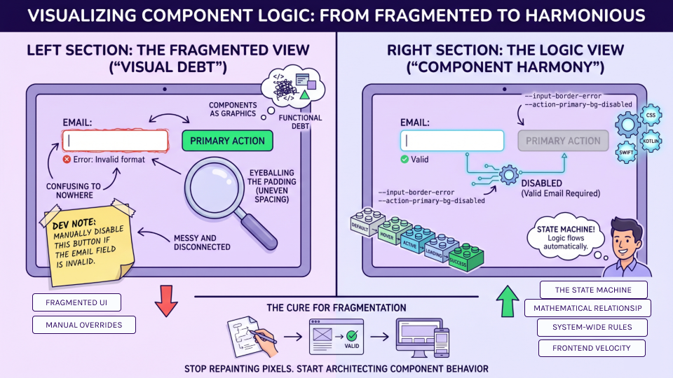
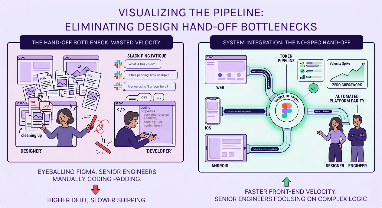
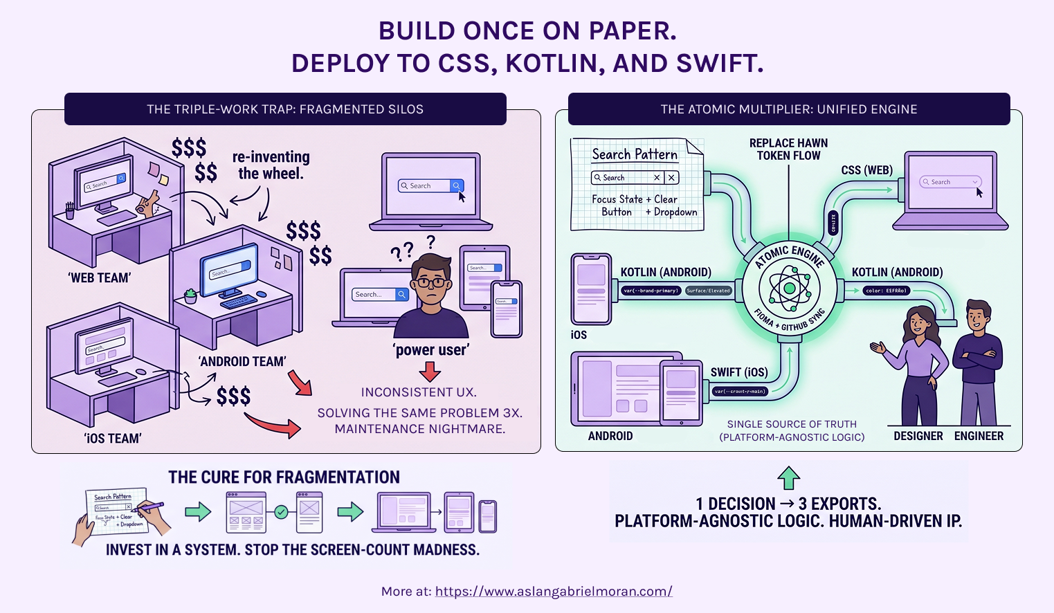
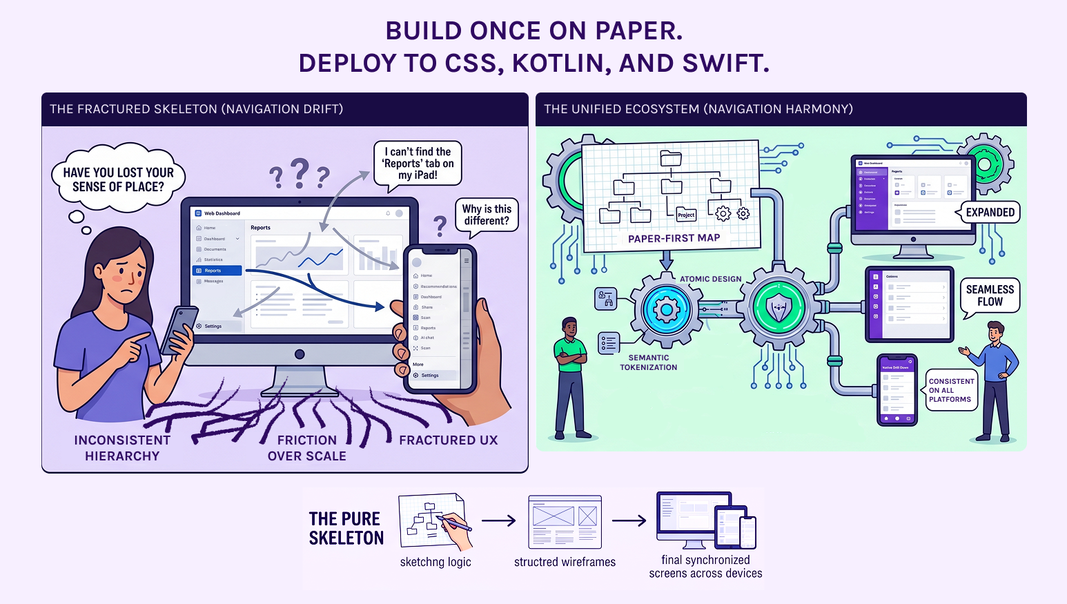
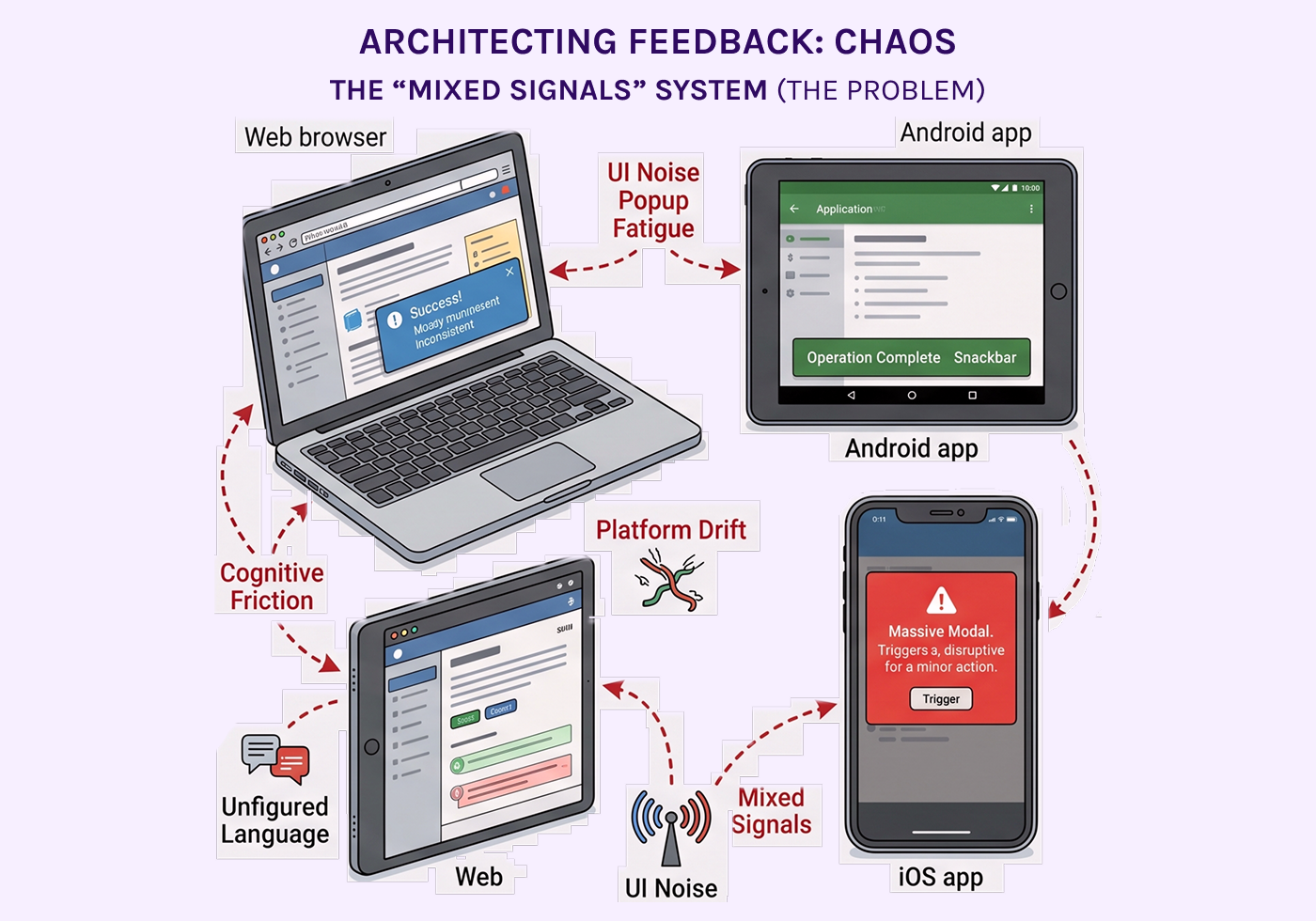
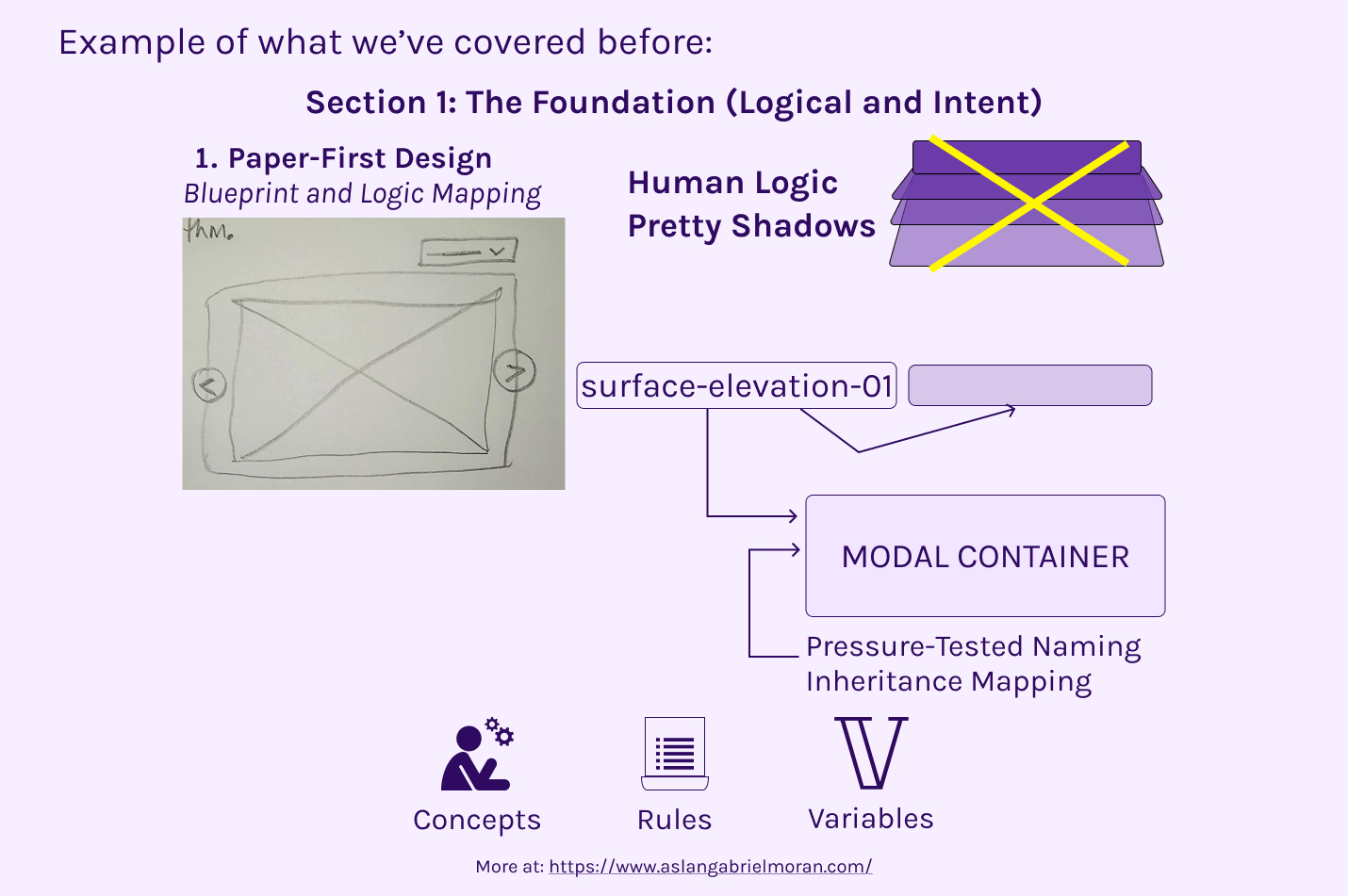
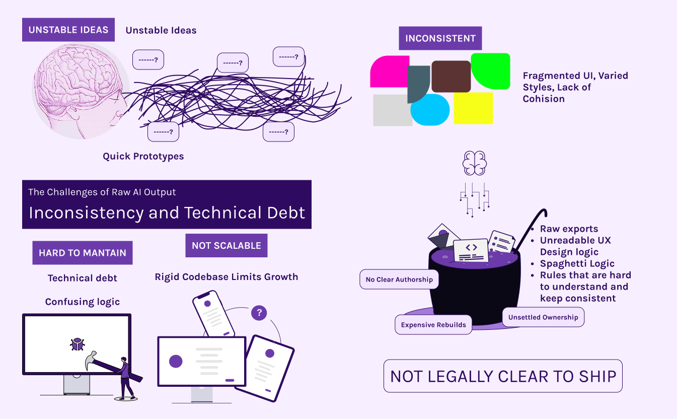
Your Figma file is a liability, not a source of truth.

Visual description of three different codding enviroments (css, swift and kotlin) and a button design on Figma labeled "Light blue"

Ready to de-risk your UI? >>

Hard-coded hex codes are high-interest debt.

Visual description of three different codding enviroments (css, swift and kotlin) and a button design on Figma labeled "Light blue"

Ready to de-risk your UI? >>

"Light Blue" is a color. "Brand-Primary-Surface" is a command.

Visual description of three different codding enviroments (css, swift and kotlin) and a button design on Figma labeled "Light blue" being fixed and good for scaling into a bigger project.

Ready to de-risk your UI? >>

16px is not a Typography System.

This panel, labeled 'THE ARCHITECT’S APPROACH,' uses a green theme to demonstrate efficiency. A Figma design uses a single semantic token: 'brand-primary-surface.' This token is managed in a central 'Design Token Pipeline,' allowing a change to automatically update the mapping for both Light Mode and Dark Mode hex codes. This centralized token is instantly implemented as a variable across Web, Android, and iOS, resulting in efficient scaling and automated updates.

Ready to de-risk your UI? >>

If you start your design in Figma, you’re already behind.

An infographic titled 'THE ARCHITECTURE BRIDGE: THE PIPELINE' demonstrating the transition from abstract logic to cross-platform production. A central 'Single Source of Truth' hub, labeled 'Architectural Logic,' processes design intent and branches out into three production-ready code blocks: Web (CSS Custom Properties), Android (Kotlin Objects), and iOS (Swift Constants). Each block shows clean, tokenized code for surface elevation and shadows. Icons for 'Code Generation,' 'Syncing,' and 'Deployment Velocity' highlight a 'Zero Guesswork' workflow for engineering teams.

Ready Ready to move past fragmented UI? >>

"Success Green" shouldn’t be a matter of opinion.

A technical infographic titled 'VISUAL PARITY: ZERO DRIFT' demonstrating cross-platform color consistency. The image uses a light purple background and dark purple text to show how a single design token ensures an identical 'Success Green' color across Web, Android, and iOS devices.

Ready Ready to move past fragmented UI? >>

Is your SaaS built on a residential or skyscraper foundation?

This image depicts two different sections from this section to represent the conclusion of the section within the series.

Ready Ready to audit your architecture? >>


Section name: The Standard

Your SaaS doesn’t need 150 screens. It needs 15 patterns.

An illustration titled 'THE HARMONY: ARCHITECTING COMPONENT PATTERNS' from the provided graphic. The top-left features a neat, organized pile of interlocking blue, green, and white isometric blocks, visually representing modular components with a 'UI LEGO BRICKS' caption. Next to it is a clean, numbered 3x4 grid labeled 'THE 15 CORE PATTERNS', showcasing specific component examples like 'DATA ENTRY PATTERN (INPUT + VALIDATION)', 'SUCCESS/WARNING STATES (TOAST & DASHBOARD)', and 'FILTERING VIEW LOGIC'. Below this, a visual grouping of multiple devices—a large desktop monitor, a tablet, and a smartphone—shows a consistent, cohesive application interface, labeled 'SYSTEM THAT SCALES: POWER MULTIPLE, COHESIVE SCREENS'. In the bottom-right, a smiling and confident engineer works efficiently at a clean workstation with multiple monitors, with thought bubbles reading 'Muscle Memory!' and 'Logic already in Kotlin/CSS!'. A final large text block summarizes 'ENGINEERING PREDICTABILITY. SCALE WITHOUT BLOAT. BOOSTED ROI.'

Ready Ready to stop the screen-count madness? >>

Your "Primary Button" is a State Machine, not a Graphic.

A side-by-side comparison titled

Ready Is your dashboard a collection of one-off components? >>

"Is this 12px or 16px?" — The Slack message that kills your velocity.

....

Tired of your dev team being slowed down by UI inconsistencies? >>

Build once on paper. Deploy to CSS, Kotlin, and Swift.

....

Ready to sync your Web, iOS, and Android workflows? >>

Your Sidebar is your Product’s Skeleton. Don't let it fracture.

....

Is your navigation logic drifting between platforms? >>

Stop whispering "Success." Start architecting Feedback

....

Is your product's feedback loop fragmented? >>


How we Eliminate Design Debt and Risk

Traceable Product Development: Ownership, Traceability & Legal Clarity

Visual description of three different codding enviroments (css, swift and kotlin) and a button design on Figma labeled "Light blue"

Ready to de-risk your UI? >>