Blog: Responsive Design Learning for Life
Responsive Web Design
Shared under the: Limited Presentation License: UX Design Process ›› license
1: Project Overview
The product
The purpose of the blog “Learning For Life” is to review courses from LinkedIn Learning and Coursera. The goal is to share a personal experience in the form of a blog in order to inspire others into learning different skills and developing note taking strategies in Cornell notes format while cultivating curiosity and thought provoking questions.
Project duration
6 months
The Problem:
Some people struggle with learning soft and hard skills and prefer to hear from someone who has learned the skills before taking the next steps.
The Goal:
Share transparent opinions and reviews about Coursera and LinkedIn Learning Courses while sharing thought and note taking process.
My role:
UX/Product designer
- Product/UX Designer: Created design and product with user focus
- Product manager: Managed product development
- UI Designer and Web developer: Created user interfaces in website
Responsibilities:
Conducting interviews, paper and digital wireframing, low and high-fidelity prototyping, conducting usability studies, accounting for accessibility, and iterating on designs.
2: Understanding the user
2.1 User research
Summary
To better understand the users I am designing for and their needs, I conducted interviews and created empathy maps. One primary user group identified through this research were college students who want to expand their horizons, knowledge and skills online.
This user group confirmed my initial assumptions about college students who wanted to read about how people learn online, without going to campus. However, the research also revealed that these users are limited in their ability to do so due to a number of factors, including:
- Trusting the reviews they see online
- Knowing where to start learning and what to learn first
- Finding a way to organize what they learn
After finding that, I moved into creating paper wireframes, wireframes, low-fidelity prototypes would turn into the first usability study and high-fidelity prototypes which turned into the closest prototype of the final product.
2.2 Problem Statement and Persona
Alice K.
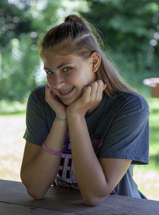 Image by “JerzyGorecki” on pixabay.com
Problem Statement
Alice is a New Yorker who wants to learn new skills but does not want to waste her time so she can focus on her studies.
Participant's About
Alice is a 22-year-old student from New York City. She is passionate about learning and wants to develop new skills that will help her advance her career and make a difference in the world. However, she is feeling overwhelmed by the number of different skills and resources available, and she doesn't know where to start. She is also worried that she doesn't have enough time or money to learn new skills.
Alice is particularly interested in learning about business, technology, and social impact. She is also interested in hearing from people who have previously learned the skills she is interested in, so that she can learn from their experiences and get advice on how to get started.
Participant Demographics
Age: 22
Education: College 3rd year in Bachelor of Arts in English from Columbia University
Hometown: NYC, NY
Country of residence: : United States of America
Family: Mother, father, sister, brother
Occupation: Student and babysitter
Alice's Goals
- Alice wants to develop her soft skills such as communication, teamwork and leadership
- Alice wants to build her network and having soft and hard skills can help her to connect with others
- Alice wants to have an understanding of global issues and see how she can contribute in the world
- Alice wants to have more hobbies and interests to which she can have fun working on
Alice's issues and frustrations
- Doesn't know where to start learning new skills
- Feels overwhelmed by the number of different skills and resources available
- Doesn't have enough time to learn new skills
- Doesn't have enough money to pay for expensive courses or bootcamps
2.3 User Journey Map
| ACTION | Action 1 Find a list of courses |
Action 2 Read feedback about the course |
Action 3 Take notes of which courses will be best for her |
Action 4 Enlist the courses that will help her on her day-to-day basis |
Action 5 Save the course and take and complete it |
| TASK- LIST | Tasks
|
Tasks
|
Tasks
|
Tasks
|
Tasks
|
|---|---|---|---|---|---|
| EMOTIONS | Alice feels inspired to search for ways to improve herself | Alice feels like the feedback is good to read because it can help her take better decision and use well her time | She would like the blog to have an option to save her preferences and not have to take notes outside the website | She feels overwhelmed because she does not know yet what her stronger and weaker skills are | She feels happy that she can have a previous knowledge of the course and know whether to take them or chose other options |
| IMPROVEMENT OPPORTUNITIES | The lists can be shorter on the website while saying more with the images displayed | Add detailed feedback while adding a scale of personal rankings | Add a note-taking feature on the website | Recommend strategies to know which skills to take first | N/A |
2.4 User research: pain points
Findings
Users showed frustrations while trying to go back into the starting point of the app on a table and on a smartphone screen.
- A user tried finding a button that will take them to the home-page without having to see the options screen
- A user tried to go back only scrolling the screen but was unable to complete action
Layout was condensed, which made actions too repetitive and took to long time to complete.
- A user did not find the action of scrolling too much pleasant
- A user commented that “Some fonts size is too big to read while others are too small
There are not options for user to agree/disagree or comment on the app
- User interactions were expected by users since its about an opinion blog website/app
- Users were expecting to see a comments section so that they could see what others thought about the page/screen they had just interacted with
3: Starting the design
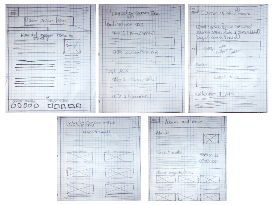
3.1: Paper wireframes
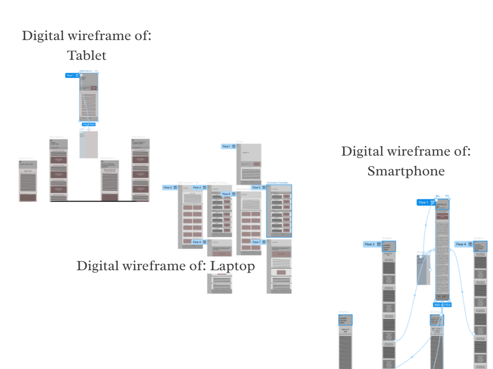
3.2: Digital wireframes
As the initial design phase continued, I made sure to base screen designs on feedback and findings the user research.
3.3: Low-fidelity prototype
The low fidelity prototype was well received for usability studies. Main points and improvement opportunities were:
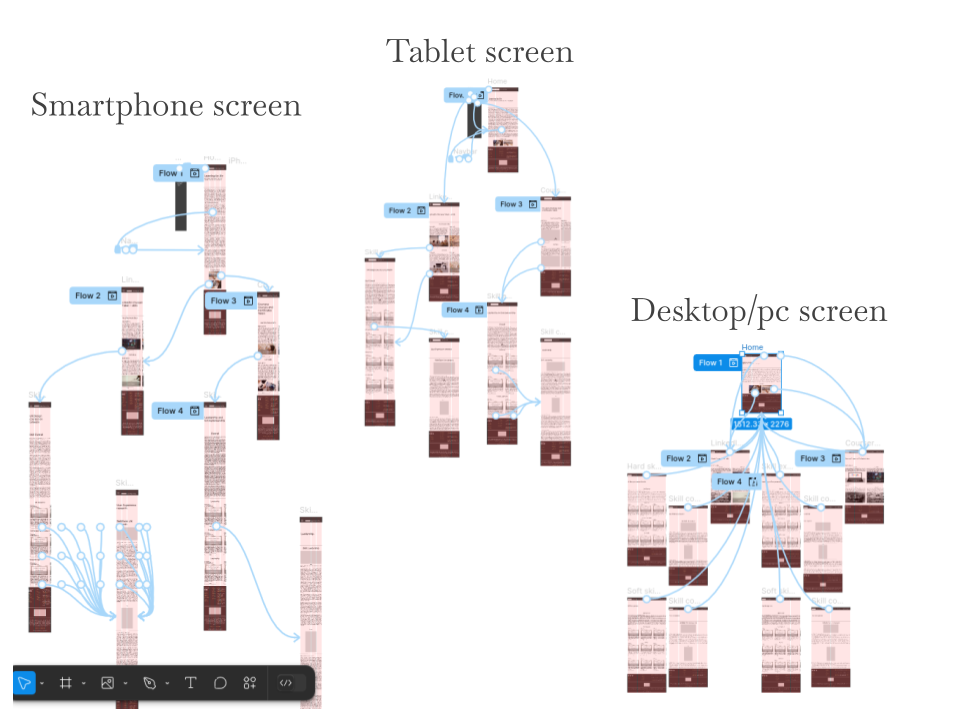
Desktop/pc screen
Smartphone screen
Tablet screen
- Change font size for accessibility reasons
- Add carousels for best interactions
- Identify where each button was taking users to which screen
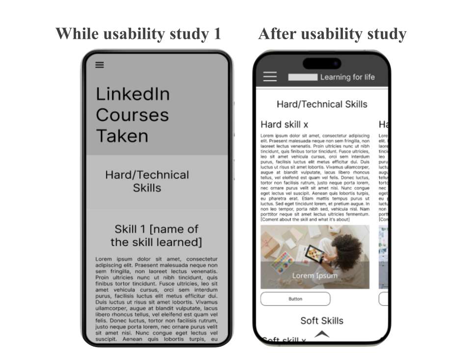
3.4 Usability study: findings
First Finding
4 out of 5 participants mentioned being unable to move sometimes from one screen to other
Second Finding
2 out 5 participants mentioned a “featured section” to find information faster
Third Finding
3 out 5 participants mentioned that is takes too much time to scroll down and other order could be better
Fourth Finding
2 out of 5 participants mentioned a “note taking” option could help them get more organized
Fifth Finding
3 out of 5 participants mentioned that they will like to see an option that can help them know which courses to take based on their own interests
Sixth Finding
2 out 5 participants mentioned that research out of the bloggers courses taken could help with trust building on the feedback and reviews
Seventh Finding
Most participants, 4 out 5, wanted to connect with others who had read the reviews to discuss which courses to take.
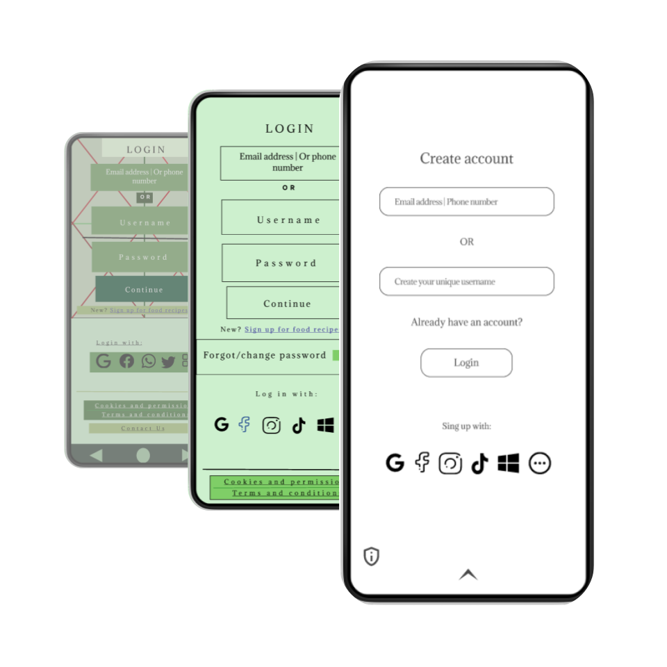
4: Refining the design
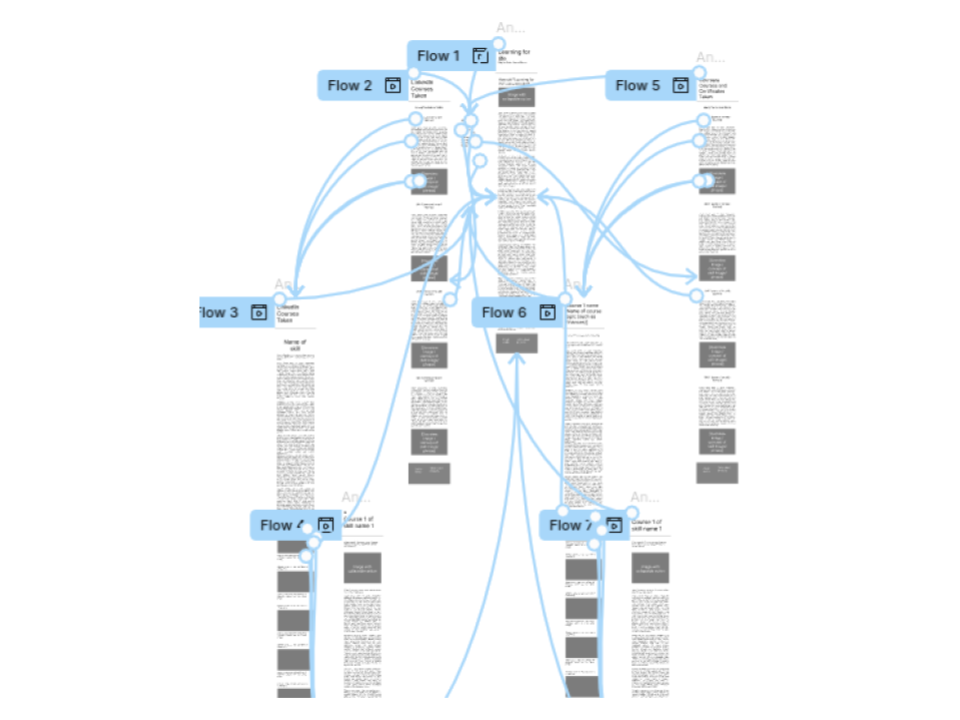
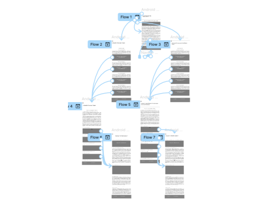
4.1: Low-fidelity prototypes to High-fidelity prototypes overview
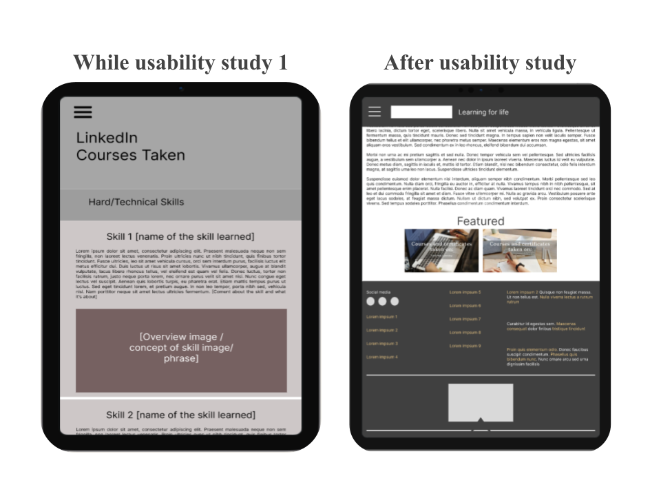
Early designs did not follow a font style and hierarchical text order while information was overwhelming and difficult to croll, after usability studies, I changed the color palette and some images were placed.
- More keywords are placed to give an idea of what the final product is going to be about
- In three designs the order in which the site is being organized if consistent and shows specifics of the content
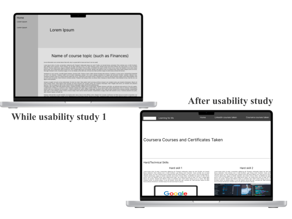
- Design has a tetradic color palette which makes the colors harmonious and pleasant to the the eyes
- More keywords are placed to give an idea of what the final product is going to be about
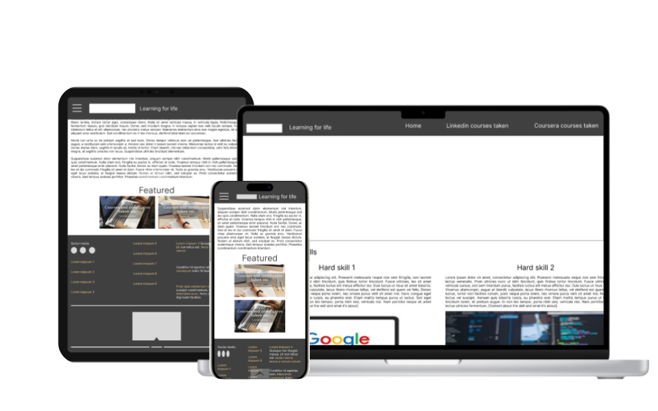
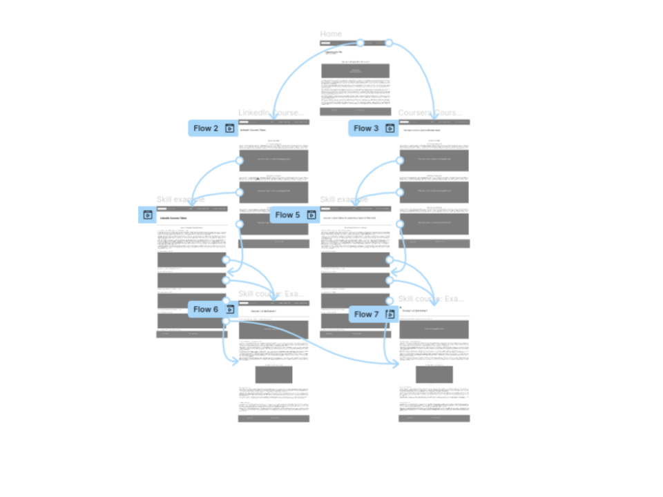
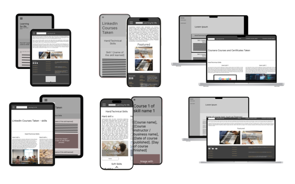
4.2: High-fidelity prototype
The final high-fidelity prototype presented cleaner user flows for navigating between recipes, seeing comments from other people and show a broader amount of recipes in less time as well as more customization for users such as having text-to-speech options.
4.3: Key mockups and screens
Accessibility considerations
1
Screen reading options will be enhanced on the final app/website
2
Pastel colors were applied and checked for accessibility reasons.
Going forward
1. Takeaways
Impact:
As my first Usability Study, I’ve understood the impact that thinking about accessibility has on different users. Adding different accessibility resources made me feel overwhelmed because that is something I neglected and never thought of. However, I thought about time where I couldn’t use a website because the text was too small and needed to use my glasses and that sometimes I’ve used screen reading options, and those options have been of great help.
What I learned:
I have learned that there are many options in where to create projects to help different kinds of people in very different areas. I comprehended that there are a lot of thing that can be done and providing people resources to optimize their time and what they learn is a really important one.
One quote from peer feedback:
“Content that helps people to save time is always good content, specially if the content is personalized and tells them different approaches”
- UX Research Participant
2. Next Steps
- Conducting an extra usability study
- Adding text-to-speech options to final product
- Adding a comment section for users to interact with each other
Final note
- This case study marks the beginning of my UX path — a snapshot of where I started. My design process has since evolved significantly since. This was latest reviewed on 2024.
Navigation Tips