00:00
Jump to Design System Intake (Form) >>
✩ or scroll down to learn more ✩
Welcome video that introduces services:
This are the subtitles from the video: Hi, I'm Aslan-Gabriel If you are a product leader or decision-maker building a digital product and dealing with inconsistent UI, unclear UX rules, or challenges translating design into development, you’re in the right place. This is for people who want a scalable, cross-platform design system (CSS, Kotlin, and Swift) without relying on generic frameworks or struggling with inconsistent implementation across teams.
Continue to next sectionJump to Design System Intake (Form) >>
✩ or scroll down to learn more ✩
This section presents a visual audit showing multiple conflicting versions of the same UI component (buttons and color hex codes) pulled from a single product. This illustrates 'Design Debt'—the friction and inconsistency that occurs when a team lacks a shared design language, forcing developers to make manual guesses.
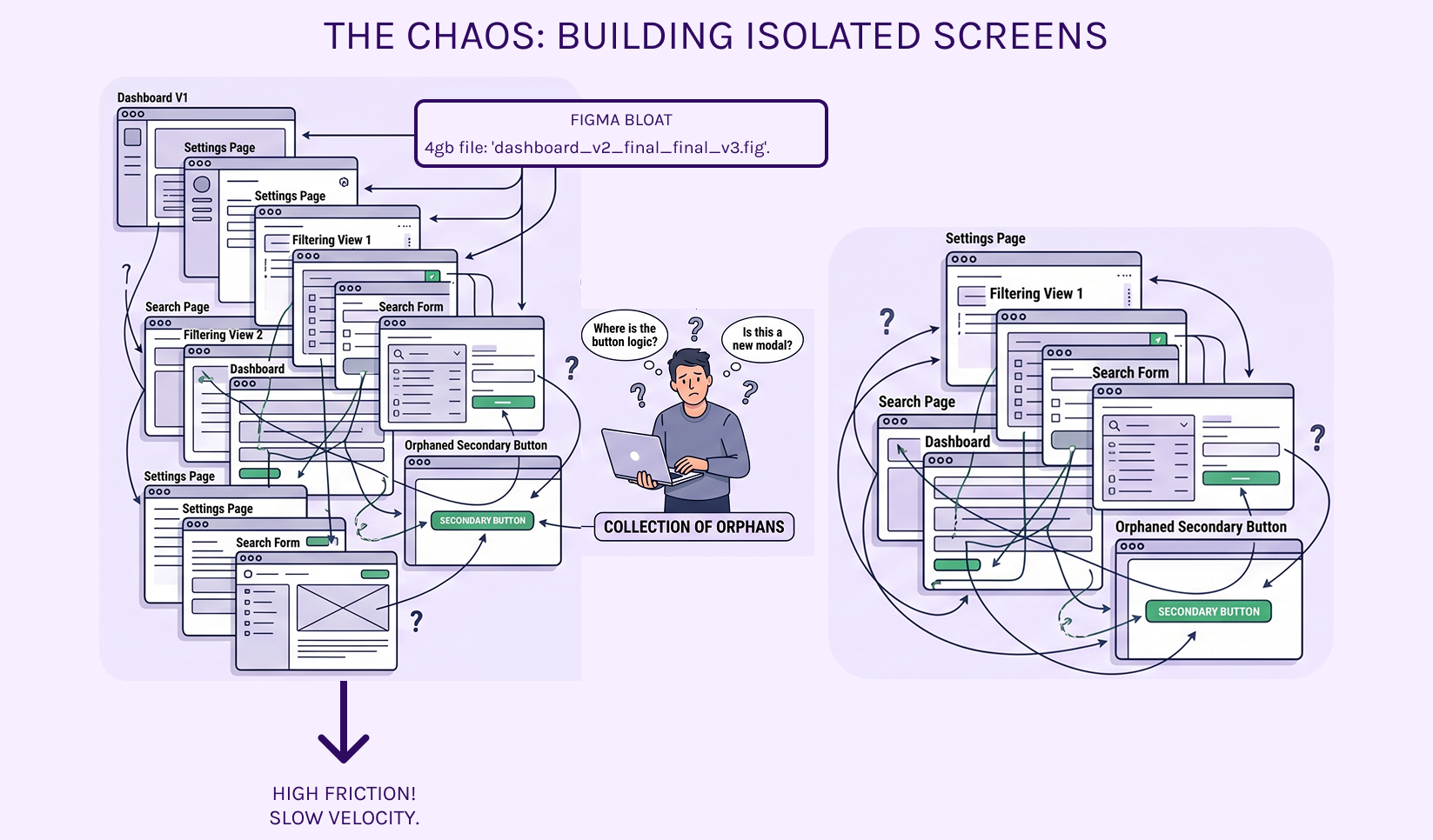
Continue to next sectionHave you noticed the product looks and behaves slightly differently depending on which part of the app you’re in? Or that shipping a simple change takes longer than it should?
Same company. Same product. Eight different interpretations.
This isn't a design problem; it's a communication failure. Without a shared language, every developer is forced to guess.
This is not a design problem or a developer problem. It is a missing shared language. Without one agreed set of rules and names, every team is forced to invent its own.
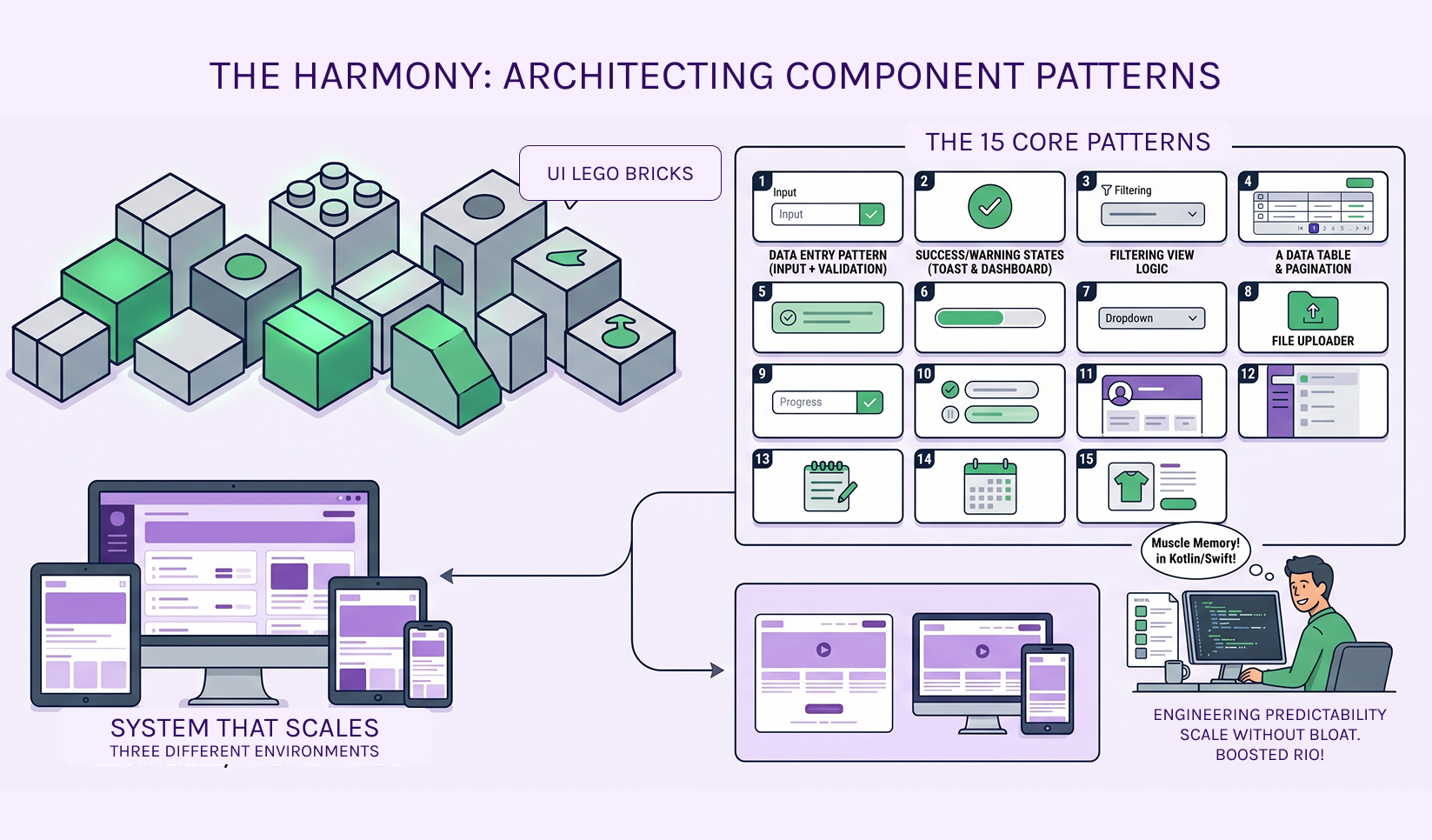
One decision (e.g., a primary color or button style) automatically flows correctly to web, Android, and iOS. Everyone uses the same names and rules. Guessing stops.
You don't need layouts; you need the logic that builds them.
/* COLORS?? WHO KNOWS */
.red { color: red; }
.red2 { color: #ff0000; }
.text-danger { color: rgb(255, 0, 0); }
.primary { color: blue; }
.primary-btn-text { color: white; }
.btn-primary-text { color: #fff; }
.blue { color: #0000ff; }
.mainBlue { color: #1e90ff; }
/* BACKGROUNDS BUT NOT REALLY CONSISTENT */
.bg-blue { background: blue; }
.bgBlue { background-color: #0000ff; }
.backgroundPrimary { background: #1e90ff; }
.primaryBackground { background: dodgerblue !important; }
/* BUTTONS (GOOD LUCK) */
.btn {
padding: 10px;
border-radius: 4px;
}
.button {
padding: 12px 20px;
border-radius: 2px;
}
.btn-primary {
background: blue;
color: white;
}
.primary-btn {
background-color: #0000ff;
color: #fff;
border: none;
}
button.primary {
background: dodgerblue;
padding: 8px;
}
.btnPrimaryLargeBig {
padding: 18px 40px;
font-size: 20px;
}
/* RANDOM OVERRIDES */
.btn-primary {
background: red; /* WHY?? */
}
.primary-btn {
background: green; /* EVEN WORSE */
}
/* TYPOGRAPHY?? KIND OF?? */
.h1 {
font-size: 32px;
}
.title {
font-size: 30px;
}
.heading-big {
font-size: 36px;
}
h1 {
font-size: 28px !important;
}
/* SPACING CHAOS */
.mt-10 { margin-top: 10px; }
.mt10 { margin-top: 10px; }
.marginTop10 { margin-top: 12px; }
.m-t-10 { margin-top: 8px; }
/* GRID?? NOPE */
.row {
display: flex;
}
.flex-row {
display: flex;
}
.row-flex {
display: flex;
}
.container {
width: 1200px;
}
.wrapper {
width: 100%;
max-width: 1180px;
}
.main-container {
width: 95%;
}
/* RESPONSIVE? LOL */
@media (max-width: 768px) {
.container {
width: 100%;
}
.wrapper {
width: 90%;
}
.btnPrimaryLargeBig {
font-size: 12px;
padding: 5px;
}
}
/* STATES??? */
.btn:hover {
background: purple;
}
.btn-primary:hover {
background: orange;
}
.primary-btn:hover {
background: pink;
}
/* DISABLED?? */
.btn:disabled {
opacity: 0.5;
}
.disabled-btn {
opacity: 0.3;
pointer-events: none;
}
/* RANDOM ONE-OFF COMPONENT */
.cardSpecialThingy {
padding: 13px;
border: 1px solid #ccc;
background: white;
}
.card {
padding: 20px;
border: none;
background: #fafafa;
}
/* Z-INDEX WARS */
.modal {
z-index: 1000;
}
.dropdown {
z-index: 2000;
}
.tooltip {
z-index: 999999;
}
/* HARDCODED WIDTHS EVERYWHERE */
.input {
width: 200px;
}
.input-large {
width: 350px;
}
.inputBig {
width: 300px;
}
========================= 1. DESIGN TOKENS =========================
root
/* Colors */
--color-primary:
#1e90ff;
--color-primary-hover:
#1c86ee;
--color-danger:
#e53935;
--color-text:
#222;
--color-background:
#0f192e;
--TextForButtons:
#ffffff;
/* Typography */
--font-family-base:
Arial, sans-serif;
--font-size-sm:
14px;
--font-size-md:
16px;
--font-size-lg:
20px;
/* Spacing */
--space-xs
4px;
--space-sm:
8px;
--space-md:
16px;
--space-lg:
24px;
/* Radius */
--radius-sm:
4px;
--radius-md:
8px;
========================= 2. DESIGN TOKENS =========================
body {
font-family:
var(--font-family-base);
font-size:
var(--font-size-md);
color:
var(--color-text);
background:
var(--color-background);
}
========================= 3. TYPOGRAPHY =========================
.text-sm
{
font-size:
var(--font-size-sm);
}
.text-md
{
font-size:
var(--font-size-md);
}
.text-lg
{
font-size:
var(--font-size-lg);
}
.heading {
font-size:
var(--font-size-lg)
font-weight:
bold;
}
========================= 4. LAYOUT UTILITIES =========================
.container {
max-width:
1200px;
margin:
0 auto;
padding:
var(--space-md);
}
.flex {
display:
flex;
}
.flex-row {
flex-direction:
row;
}
.gap-md {
gap:
var(--space-md);
}
========================= 5. COMPONENT: BUTTON =========================
.btn {
display:
inline-block;
padding:
var(--space-sm) var(--space-md);
border-radius:
var(--radius-sm);
font-size:
var(--font-size-md);
border:
none;
cursor:
pointer
transition:
background 0.2s ease;
}
/* Variants */
.btn {
background:
var(--color-primary-hover);
}
.btn--primary {
background:
var(--color-primary);
}
.btn--primary:hover {
background:
var(--color-primary-hover);
}
.btn--danger {
background:
var(--color-danger);
color:
#fff;
}
/* States */
.btn:disabled {
opacity:
0.5;
cursor:
not-allowed;
}
/* Sizes */
.btn--lg {
padding:
var(--space-md) var(--space-lg);
font-size:
var(--font-size-lg);
}
========================= 6. COMPONENT: CARD =========================
.card {
padding:
var(--space-md);
border-radius:
var(--radius-md);
background:
#fafafa;
border:
1px solid #eee;
}
Testimonials
As a friend who’s followed Aslan's work for years, I can confidently say she’s one of the most thoughtful and systematic Product Designers I know. She doesn’t just create beautiful interfaces—she builds the invisible architecture that makes entire products feel intuitive, consistent, and built to last.
As his work colleague, I have been impressed by
Aslan’s eagerness to research and apply new skills and programs- and her patience in helping
me understand them. I have learned a lot from her about design and outreach. She is diligent
in organizing meetings and working with me on projects, and when we split things up, she is
great at summarizing his findings. Aslan puts a lot on her plate, but she holds herself
accountable to his work and is always easy to reach when plans change.
Aslan is a great teammate and would be in any project.
Working with Aslan Gabriel throughout this project was a smooth and rewarding experience. His strengths as a UX/UI designer showed through in his design decisions, especially around spacing and animation—areas where I personally learned a lot. He’s easy to communicate with, thoughtful in his approach, and always open to collaboration. Despite challenges like time zone differences, we stayed aligned and were able to meet deadlines thanks to his flexibility and responsiveness. Having him on the team made a real difference, and I’d gladly work with him again.
What stands out most is her 'structure first' approach: she digs deep with research, maps user journeys logically, and creates scalable Design Systems that eliminate design debt and make handoff to developers seamless. Whether it’s strategic solutions for growing teams or full UX architecture, Aslan brings clarity, intention, and respect for users’ time and cognitive load that’s rare in the industry.
I’d recommend her services to any founder, product team, or tech business struggling with inconsistent experiences or scaling their design language. Working with (or learning from) Aslan means you get not just designs, but a solid foundation that supports real growth. She’s the expert you want on your side when you’re serious about user-centered, future-proof products.
I am pleased to recommend Aslan Gabriel for any opportunity in research and development of new technologies.I have participated in several of her projects and can attest that she is exceptionally talented, motivated, and a fast learner with a strong ability to apply knowledge.She is an outstanding team player, always collaborative and supportive, as well as highly organized, methodical, and excellent at time management. She adapts easily to change and is always eager to learn and grow.I have also known her as a long-time friend. She is kind, respectful, unconditionally supportive, and always willing to help.In short, Aslan is an exceptional professional and person who combines strong technical skills with excellent interpersonal qualities and dedication. She would be a valuable asset to any organization seeking talent and commitment.
A preview of 'The System Diagnostic' inquiry form, highlighting fields for technical stack selection and friction point identification. This serves as the initial intake process to align our system architecture with your specific real-world constraints.
This section also presents who this service is, vs who it is not for.
2-week MVPs, "Vibe-based" design, teams without developers.
Scalable SaaS, Multi-platform products, teams valuing long-term maintainability.
Case Studies and App Designs >>
+ UX Design Case Studies, UX Design Process - Understanding a User
Navigation Tips