00:00
Welcome video that introduces services:
This are the subtitles from the video: Hi, I'm Aslan-Gabriel If you are a product leader or decision-maker building a digital product and dealing with inconsistent UI, unclear UX rules, or challenges translating design into development, you’re in the right place. This is for people who want a scalable, cross-platform design system (CSS, Kotlin, and Swift) without relying on generic frameworks or struggling with inconsistent implementation across teams.
Continue to next sectionAslan-Gabriel Moran
Design System Services
Jump to Design System Intake (Form)
>>
This section presents a visual audit showing multiple conflicting versions of the same UI component
(buttons and color hex
codes) pulled from a single product. This illustrates 'Design Debt'—the friction and inconsistency
that occurs when a team lacks a shared design language, forcing developers to make manual guesses.
Continue to next section
You have components, but you don't have a language.
This isn't a design problem; it's a communication failure. Without a shared language,
every
developer is forced to guess.
Jump to Design System Intake (Form) >>
This section presents a visual audit showing multiple conflicting versions of the same UI component (buttons and color hex codes) pulled from a single product. This illustrates 'Design Debt'—the friction and inconsistency that occurs when a team lacks a shared design language, forcing developers to make manual guesses.
Continue to next sectionYou have components, but you don't have a language.
This isn't a design problem; it's a communication failure. Without a shared language, every developer is forced to guess.
A technical diagram of a Design Token architecture. A single design decision (a primary color variable) is shown automatically propagating into three distinct code environments: Vanilla CSS for Web, Kotlin for Android, and Swift for iOS. This demonstrates how a system ensures cross-platform synchronization from a single source of truth.
Continue to next sectionMoving from pages to patterns.
One decision. Three platforms. Zero translation errors.
Code Variable
color-primary-600: #0052FF
Web
.btn { background: var(--color-primary-600); }
Android
color = ColorTokens.Primary600
iOS
backgroundColor = .primary600
This section gives an example of a design system that makes no logical sense, its conflicting, not usable and creates conflicts for design requirements and goals. While, in contrast with the other structured example that is well organized, has design tokens to make sense of the design and makes things faster and easier for designers and developers to know what they are making.
Elimination of Design Debt.
We don't deliver layouts; we deliver the logic that builds them. This reduces onboarding from weeks to hours.
Team02-interaction-logic.css
/* COLORS?? WHO KNOWS */
.red { color: red; }
.red2 { color: #ff0000; }
.text-danger { color: rgb(255, 0, 0); }
.primary { color: blue; }
.primary-btn-text { color: white; }
.btn-primary-text { color: #fff; }
.blue { color: #0000ff; }
.mainBlue { color: #1e90ff; }
/* BACKGROUNDS BUT NOT REALLY CONSISTENT */
.bg-blue { background: blue; }
.bgBlue { background-color: #0000ff; }
.backgroundPrimary { background: #1e90ff; }
.primaryBackground { background: dodgerblue !important; }
/* BUTTONS (GOOD LUCK) */
.btn {
padding: 10px;
border-radius: 4px;
}
.button {
padding: 12px 20px;
border-radius: 2px;
}
.btn-primary {
background: blue;
color: white;
}
.primary-btn {
background-color: #0000ff;
color: #fff;
border: none;
}
button.primary {
background: dodgerblue;
padding: 8px;
}
.btnPrimaryLargeBig {
padding: 18px 40px;
font-size: 20px;
}
/* RANDOM OVERRIDES */
.btn-primary {
background: red; /* WHY?? */
}
.primary-btn {
background: green; /* EVEN WORSE */
}
/* TYPOGRAPHY?? KIND OF?? */
.h1 {
font-size: 32px;
}
.title {
font-size: 30px;
}
.heading-big {
font-size: 36px;
}
h1 {
font-size: 28px !important;
}
/* SPACING CHAOS */
.mt-10 { margin-top: 10px; }
.mt10 { margin-top: 10px; }
.marginTop10 { margin-top: 12px; }
.m-t-10 { margin-top: 8px; }
/* GRID?? NOPE */
.row {
display: flex;
}
.flex-row {
display: flex;
}
.row-flex {
display: flex;
}
.container {
width: 1200px;
}
.wrapper {
width: 100%;
max-width: 1180px;
}
.main-container {
width: 95%;
}
/* RESPONSIVE? LOL */
@media (max-width: 768px) {
.container {
width: 100%;
}
.wrapper {
width: 90%;
}
.btnPrimaryLargeBig {
font-size: 12px;
padding: 5px;
}
}
/* STATES??? */
.btn:hover {
background: purple;
}
.btn-primary:hover {
background: orange;
}
.primary-btn:hover {
background: pink;
}
/* DISABLED?? */
.btn:disabled {
opacity: 0.5;
}
.disabled-btn {
opacity: 0.3;
pointer-events: none;
}
/* RANDOM ONE-OFF COMPONENT */
.cardSpecialThingy {
padding: 13px;
border: 1px solid #ccc;
background: white;
}
.card {
padding: 20px;
border: none;
background: #fafafa;
}
/* Z-INDEX WARS */
.modal {
z-index: 1000;
}
.dropdown {
z-index: 2000;
}
.tooltip {
z-index: 999999;
}
/* HARDCODED WIDTHS EVERYWHERE */
.input {
width: 200px;
}
.input-large {
width: 350px;
}
.inputBig {
width: 300px;
}
YourDesign.css
========================= 1. DESIGN TOKENS =========================
root
/* Colors */
--color-primary:
#1e90ff;
--color-primary-hover:
#1c86ee;
--color-danger:
#e53935;
--color-text:
#222;
--color-background:
#0f192e;
--TextForButtons:
#ffffff;
/* Typography */
--font-family-base:
Arial, sans-serif;
--font-size-sm:
14px;
--font-size-md:
16px;
--font-size-lg:
20px;
/* Spacing */
--space-xs
4px;
--space-sm:
8px;
--space-md:
16px;
--space-lg:
24px;
/* Radius */
--radius-sm:
4px;
--radius-md:
8px;
========================= 2. DESIGN TOKENS =========================
body {
font-family:
var(--font-family-base);
font-size:
var(--font-size-md);
color:
var(--color-text);
background:
var(--color-background);
}
========================= 3. TYPOGRAPHY =========================
.text-sm
{
font-size:
var(--font-size-sm);
}
.text-md
{
font-size:
var(--font-size-md);
}
.text-lg
{
font-size:
var(--font-size-lg);
}
.heading {
font-size:
var(--font-size-lg)
font-weight:
bold;
}
========================= 4. LAYOUT UTILITIES =========================
.container {
max-width:
1200px;
margin:
0 auto;
padding:
var(--space-md);
}
.flex {
display:
flex;
}
.flex-row {
flex-direction:
row;
}
.gap-md {
gap:
var(--space-md);
}
========================= 5. COMPONENT: BUTTON =========================
.btn {
display:
inline-block;
padding:
var(--space-sm) var(--space-md);
border-radius:
var(--radius-sm);
font-size:
var(--font-size-md);
border:
none;
cursor:
pointer
transition:
background 0.2s ease;
}
/* Variants */
.btn {
background:
var(--color-primary-hover);
}
.btn--primary {
background:
var(--color-primary);
}
.btn--primary:hover {
background:
var(--color-primary-hover);
}
.btn--danger {
background:
var(--color-danger);
color:
#fff;
}
/* States */
.btn:disabled {
opacity:
0.5;
cursor:
not-allowed;
}
/* Sizes */
.btn--lg {
padding:
var(--space-md) var(--space-lg);
font-size:
var(--font-size-lg);
}
========================= 6. COMPONENT: CARD =========================
.card {
padding:
var(--space-md);
border-radius:
var(--radius-md);
background:
#fafafa;
border:
1px solid #eee;
}
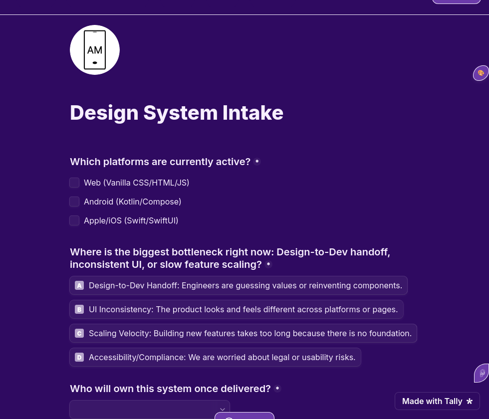
A preview of 'The System Diagnostic' inquiry form, highlighting fields for technical stack selection and friction point identification. This serves as the initial intake process to align our system architecture with your specific real-world constraints.
This section also presents who this service is, vs who it is not for.
Who this is for
This is NOT for
2-week MVPs, "Vibe-based" design, teams without developers.
This is for
Scalable SaaS, Multi-platform products, teams valuing long-term maintainability.
The first step to a system is a diagnosis. Tell us about your technical constraints