Ethan Green’s recipes app Case study
Mobile first philosophy based design
Shared under the: Limited Presentation License: UX Design Process ›› license
1: Project Overview
The product
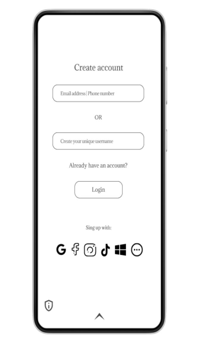
This project aims to develop a business that specializes in designing interactive login pages and user interactions. The business will leverage existing website details, images, and colors to create more engaging and user-friendly designs. Additionally the login pages will help the business owner (Ethan Greens, our user) to collect and analyze user activity data to inform the development of new products and services.
Project duration
11 months
The Problem:
Ethan Green (persona) wants to construct an app to share his recipes to the world, he wants to own and manage his own space with what he already has, but doesn’t know hot to create his idea.
The Goal:
Create an app design for Ethan Green’s audience where interaction among users is possible (e.g; chat, comment, share, like and others.)
My role:
UX/Product designer
- Product/UX Designer: Created design and product with user focus
- Product manager: Managed product development
- UI Designer and Web developer: Created user interfaces in website
Responsibilities:
Conduct pre-design research, create design from paper wireframes to high-fidelity prototypes, usability testing studies and iterate on design based on the research.
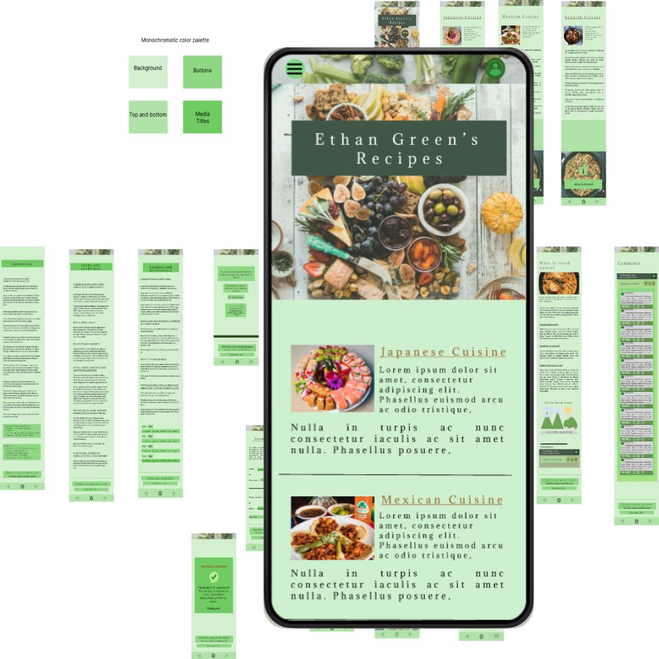
2: Starting the Design
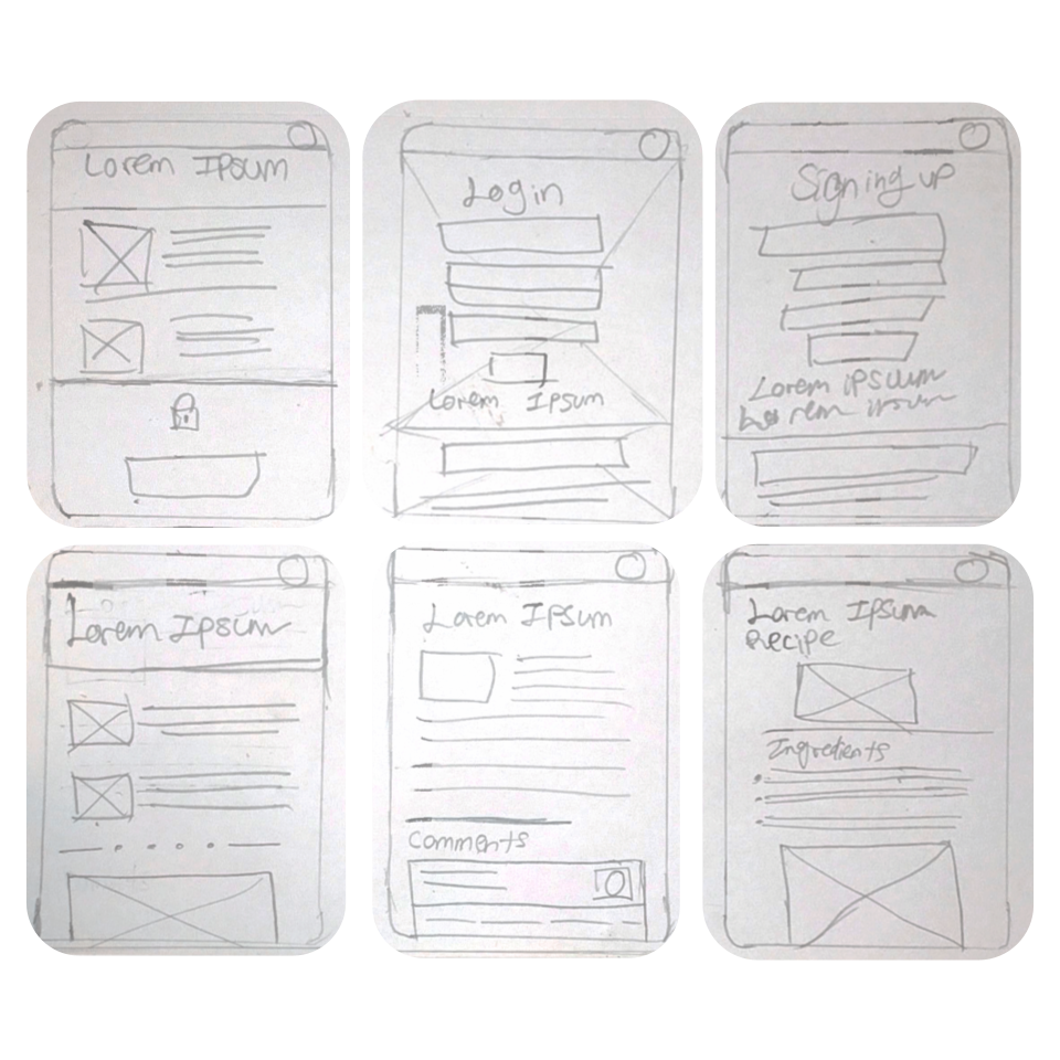
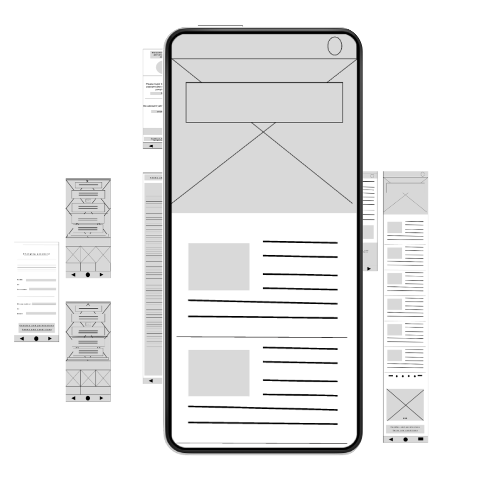
2.1 Paper wireframes
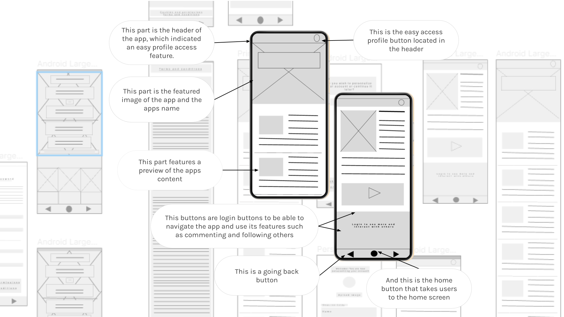
2.2 Digital wireframes
As the initial design phase continued, I made sure to base screen designs on feedback and findings from the user research.
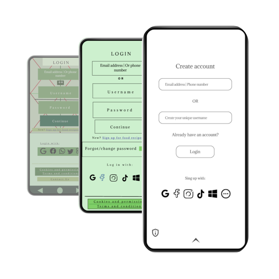
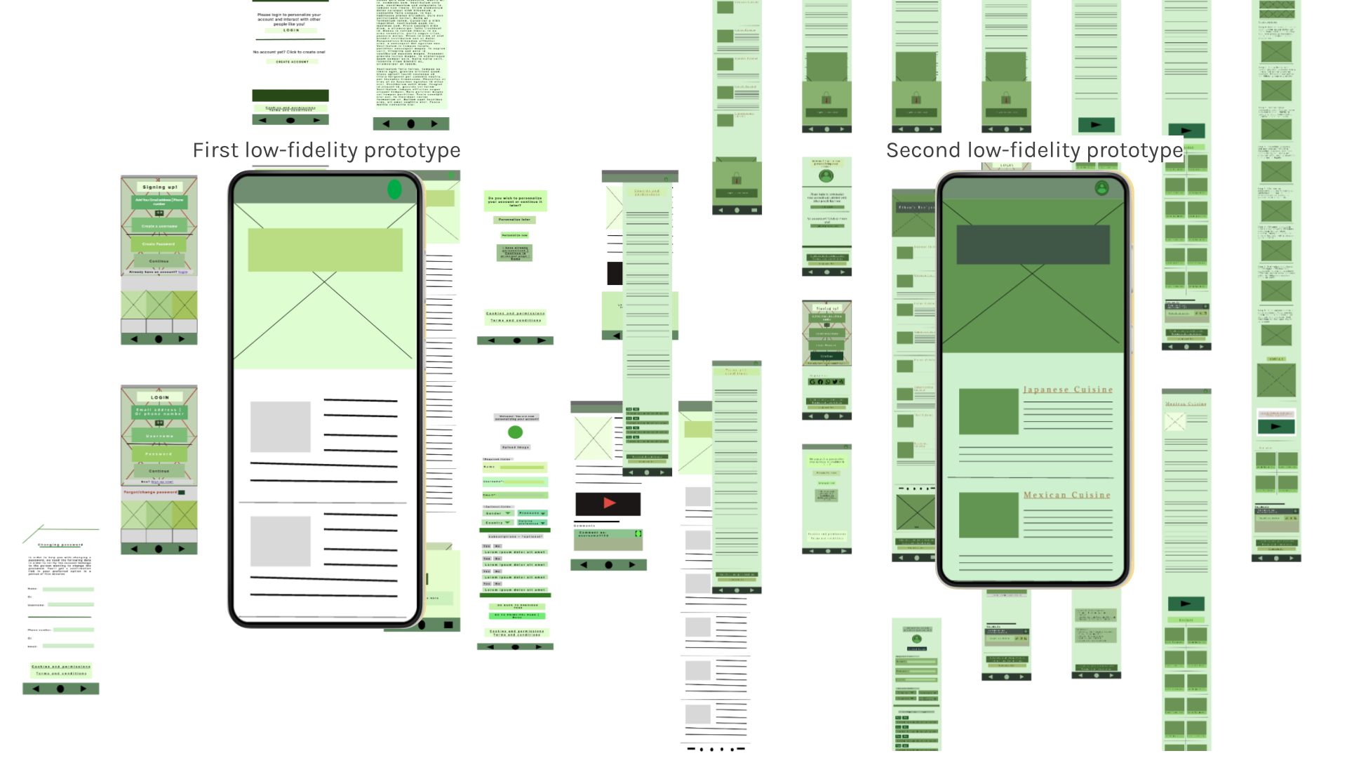
2.3 Low-fidelity prototypes
First Low-Fidelity Prototye & Second Fidelity PrototypeFirst low-fidelity prototype
Ethan didn’t have a specific brand identity, therefore we had to try some colors first after finalizing his brand design identity.
Second low-fidelity prototype
After developing his brand identity, I tried different formats and this layout was chosen among three different options in total.
2.4 First usability testing research study
Findings
I conducted two rounds of usability studies in which the findings were:
- 3 out 5 participants thought the information shown to them at once was too overwhelming to watch
- 2 out of 5 participants mentioned an unease because of the lack of icons shown in the site
- 5 out of 5 participants mentioned their concern for a non existent password change method
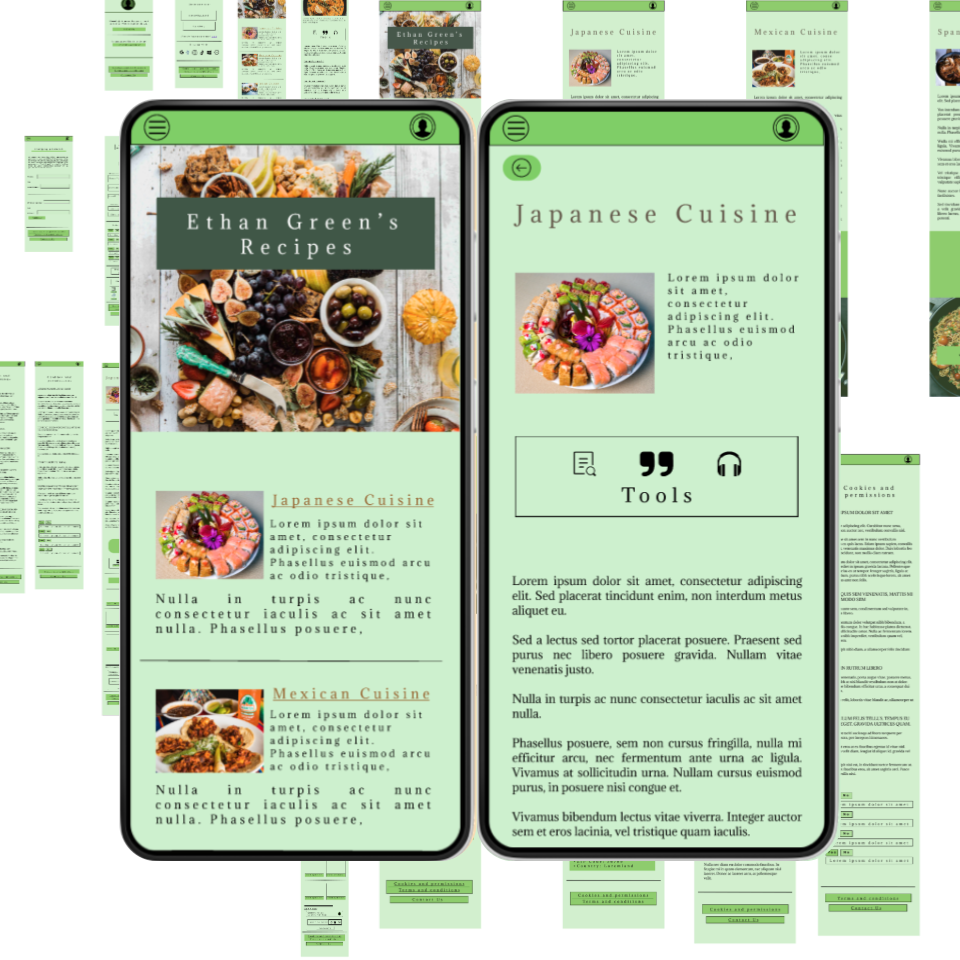
3: High Fidelity Prototype and Second Usability Study
3.1: First high-fidelity prototype
With the insights gathered from the usability testing research study and obtain feedback, I continued to create a high-fidelity prototype used for the second usability testing research study.
3.2: Second usability testing research study
Findings
The second study used a high-fidelity prototype and revealed what aspects of the mockups needed refining:
- 2 out of 5 participants suggested accessibility options such as text-to-speech option.
- 3 out of 5 participants thought that colors did not match and that gave them stress
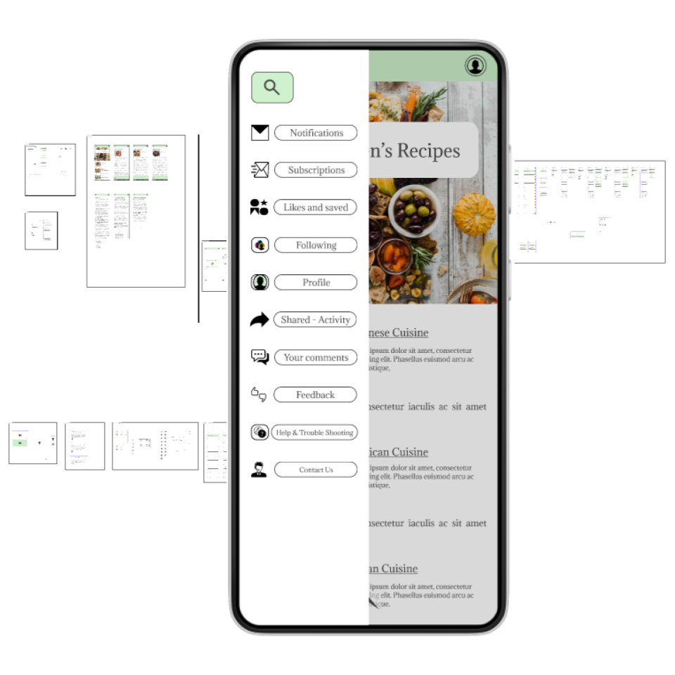
- 5 out of 5 participants said that they can’t find what they are looking for because of non existent navigation screen/sidebar
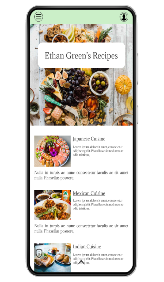
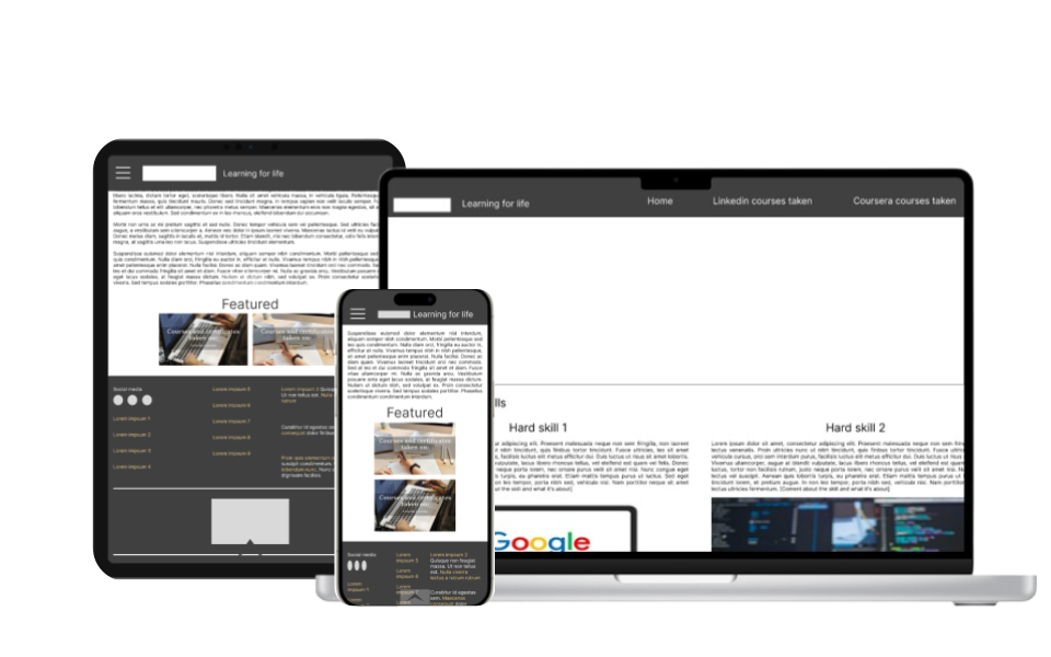
4: Second High-Fidelity Prototype
Second high-fidelity prototype with enhanced accessibility options
With the insights gathered from the second usability testing research study and obtain feedback, I continued to create the second high-fidelity prototype with enhanced accessibility
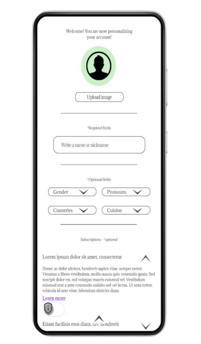
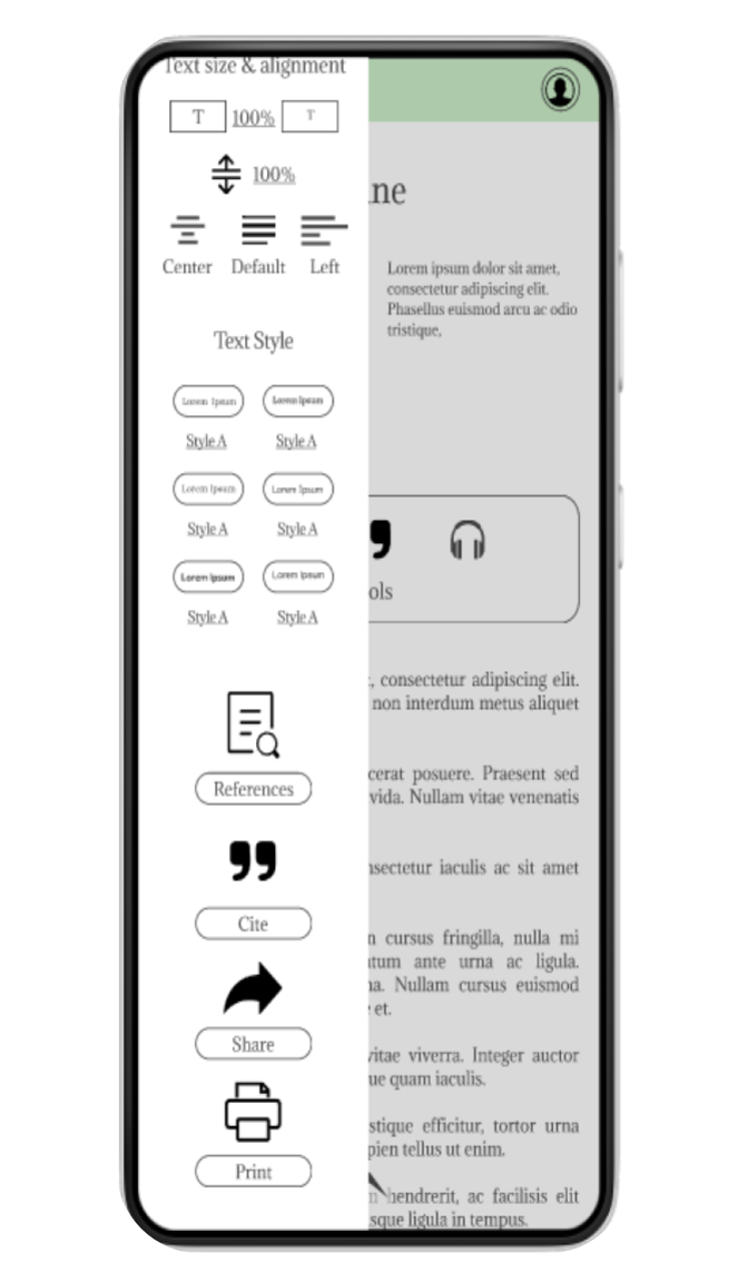
- Accessibility implementations: Early designs did not allow accessibility of any kind and had a different font style. After usability studies I included accessibility options such as alt text for images and text-to-speech options while having less information in one screen that features well relevant content that is not overwhelming for different users. I also changed colors for consistency and iterated on the sidebars for easy access of options.
5: User Research: Feedback
User research: Design feedback
Color contrast irritates some users
- 3 out of 5 users say colors are too strong for their eyes
- 2 out of 5 users say that colors are not compatible for dark mode, which makes them want to use the app less
Buttons don’t react, making users stuck at completing tasks
- 4 out of 5 users mentioned more than 4 buttons not working properly
Spacing was noticed to be incongruent within some elements
- 3 out of 5 users mentioned noticing more than 4 elements being not aligned “well” or changing sizes from screen to screen
Newest high-fidelity prototype iteration
Elements alignment fixation
Previous designs weren’t aligned with a specific guide, which made some elements appear further or closed from what it was intended to be. Newest version implements a solid and rigid guidelines to follow for space between elements living for enough space to read, touch comfortable see the information displayed.
Elements size changes
Some buttons were larger than others unintendedly and showed no reaction while pressed with a misuse of transitions and animations to add interaction between actions. New elements follow a ration aspect to differentiate within their purposes.
Color contrast corrections
Colors have been drastically changed, without changing the brands identity or altering the apps purpose.
Initial Wireframes vs Newest Iteration
Initial wireframes
Newest iteration
Going forward
1. Takeaways
Impact:
I can firmly admit that designing with inspiration from fellow designers and analyzing digital products myself has been of great help. Iterating this design has given me the opportunity to search more things related to design and think beyond what I was comfortable with so far.
What I learned:
Empathy and understanding directed to users and fellow designers is crucial for any design. Although reaching out to others might be complicated, doing so will open new tunnels and inspirations for creativity and always lead to good criticism and connections.
One quote from peer feedback:
""The app is designed for Ethan to share his recipes while giving his followers a space to connect, swap stories, and bond over their favorite dishes. It's the good mix of culinary content, a fun vibe, and a community that loves to cook and share together."
- Fellow UX Designer
2. Next Steps
- Add more functionality and pages for the design continuous development
- Conduct more user research to determine any new areas of improvement needed
- Iterate on desing system and accessibility
Figma Interactive Prototype
Final note
- This case study marks the beginning of my UX path — a snapshot of where I started. My design process has since evolved significantly since. This was latest reviewed on 2024.
Navigation Tips