Aslan-Gabriel Moran

Great UX is invisible — users remember how it felt, not how it looked.

Strategic Solutions >>Blog >> FAQ >>Programs >>

✩ scroll down to learn more ✩


The Early Stage

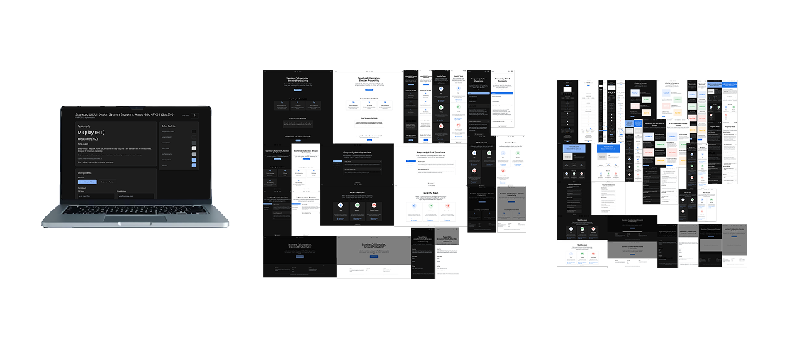
At the beginning of a project, designing a UX system can feel overwhelming. Decisions accumulate quickly — layout structure, component behavior, spacing rules, accessibility requirements, responsive constraints, and visual hierarchy.


Without a clear framework, teams often reinvent the same decisions repeatedly.

Examples of Strategic Solutions at different stages

A UX Design System exists to reduce that uncertainty.

It provides a structured foundation that helps teams:

  • Reason about design decisions instead of guessing
  • Maintain consistency across interfaces and pages
  • Scale products without redesigning core patterns repeatedly

When structure exists, design becomes easier to maintain, expand, and communicate.

An example of a Strategic Solutions consistent design highlighted by a red line to demonstrate its grids.


Not every team operates at the same stage of maturity.

Others already have experience and need deeper architectural guidance.

Here you will find multiple UX Design System families, allowing you to choose a framework that matches the position you are currently operating from.

Examples of Strategic Solutions at different stages

Website environments and Figma-based workflows.

The UX Design Systems currently available focus on website environments and Figma-based workflows.


They provide structured guidance for building consistent web interfaces using scalable layout rules, component architecture, spacing models, and accessibility-aware design principles.

Image example with Website Environment examples and Figma software workspace environment

UX/UI Design System

Interactive Reference Implementation Example.

Typography

H1 Title

H2 Section Header

H3 Channel Name

Body Text: Used for primary content like messages and descriptions. It's designed for readability and clarity.

Caption: For timestamps and helper text.

Iconography

16px (Inline)

24px (Nav)

32px (Card)

Color Palette

Background
Card Surface
Primary Text
Primary Button
Border

Components


Who are you?

These are suggested starting points depending on who you are, and what you're looking to accomplish.


The goal is not to provide rigid templates, but structured foundations that help teams reason about design decisions with clarity and confidence.

Find your Strategic Solution >>

Explore all Strategic Solutions

Blog and Resources

Design resources, tips, resources, methodology and others.

Blog >>

Programs

Partnership programs: Sales, Designers, Front-End and Back-End Developers

See Programs >>

Navigation Tips