Your SaaS doesn’t need 150 screens. It needs 15 patterns.
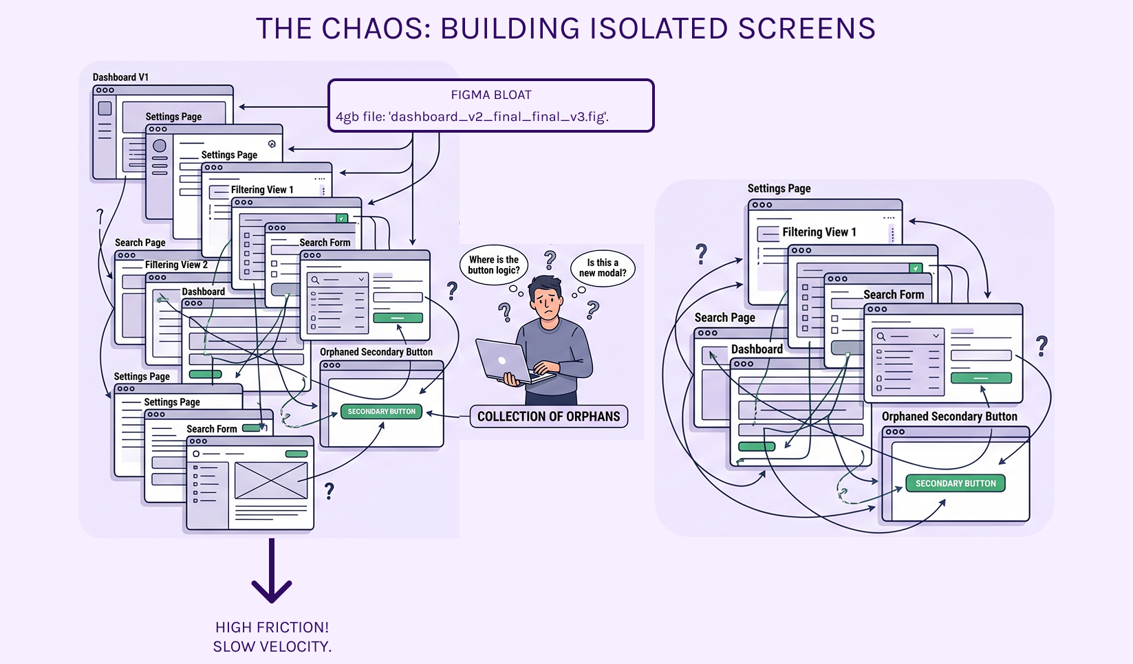
The biggest mistake Post-Series A teams make is hiring designers to "build screens." You end up with a Figma file that’s 4GBs of "Dashboard_V2_Final_FINAL_v3.fig." When a developer needs to build a new filtering view, they have to hunt through six different frames just to figure out how a secondary button behaves next to a search input.
That isn’t a product; it’s a collection of orphans.
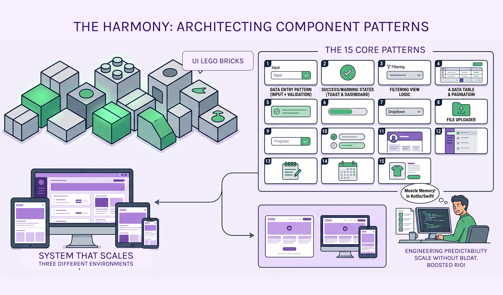
The Architecture of Harmony
In the Collaboration and Productivity space, complexity is the enemy of velocity. We don’t design "pages." We architect Component Patterns. When you define the logic of a Data Entry Pattern (Input + Validation + Primary Action) correctly, you don’t need to design 50 different forms. The pattern handles the heavy lifting.
Why "Patterns" beat "Pages" for your ROI:
- Engineering Predictability: Your devs stop asking "Is this a new modal or the same one from the settings page?" If it’s in the pattern library, the logic is already written in Kotlin, Swift, and CSS.
- Cognitive Load: Users in deep-work tools (SaaS/FinTech) rely on muscle memory. Patterns ensure that "Success" and "Warning" states feel the same on a mobile toast notification as they do on a desktop dashboard.
- Scale Without Bloat: You can ship a brand-new feature module in days, not weeks, because 90% of the UI "Lego bricks" already exist and are technically validated.
The "Paper-First" Proof
Before we touch Figma, we map these patterns on paper. Why? Because if the logic of how a button and an input interact doesn't work in a sketch, a "pretty" UI won't save it. We solve the functional friction before we ever worry about the pixels.
Note: There are other design processes like flowcharts applied prior to moving into coding.Stop paying for "more screens." Start investing in a system that scales.
Efficiency isn't about how many files you have; it's about how many screens those 15 core patterns can reliably power. (Hint: It’s usually all of them!)
Ready to stop the screen-count madness? Submit our Design System Intake >> form