"Success Green" shouldn’t be a matter of opinion.
If your product looks slightly "off" when switching from your Web dashboard to your Android app, you don’t have a brand—you have a rendering problem.
In B2B SaaS, Visual Parity is more than just aesthetics; it’s a signal of product maturity. When your colors, typography, and spacing drift across platforms, it creates cognitive load for your users and a maintenance nightmare for your devs.
The Platform Gap
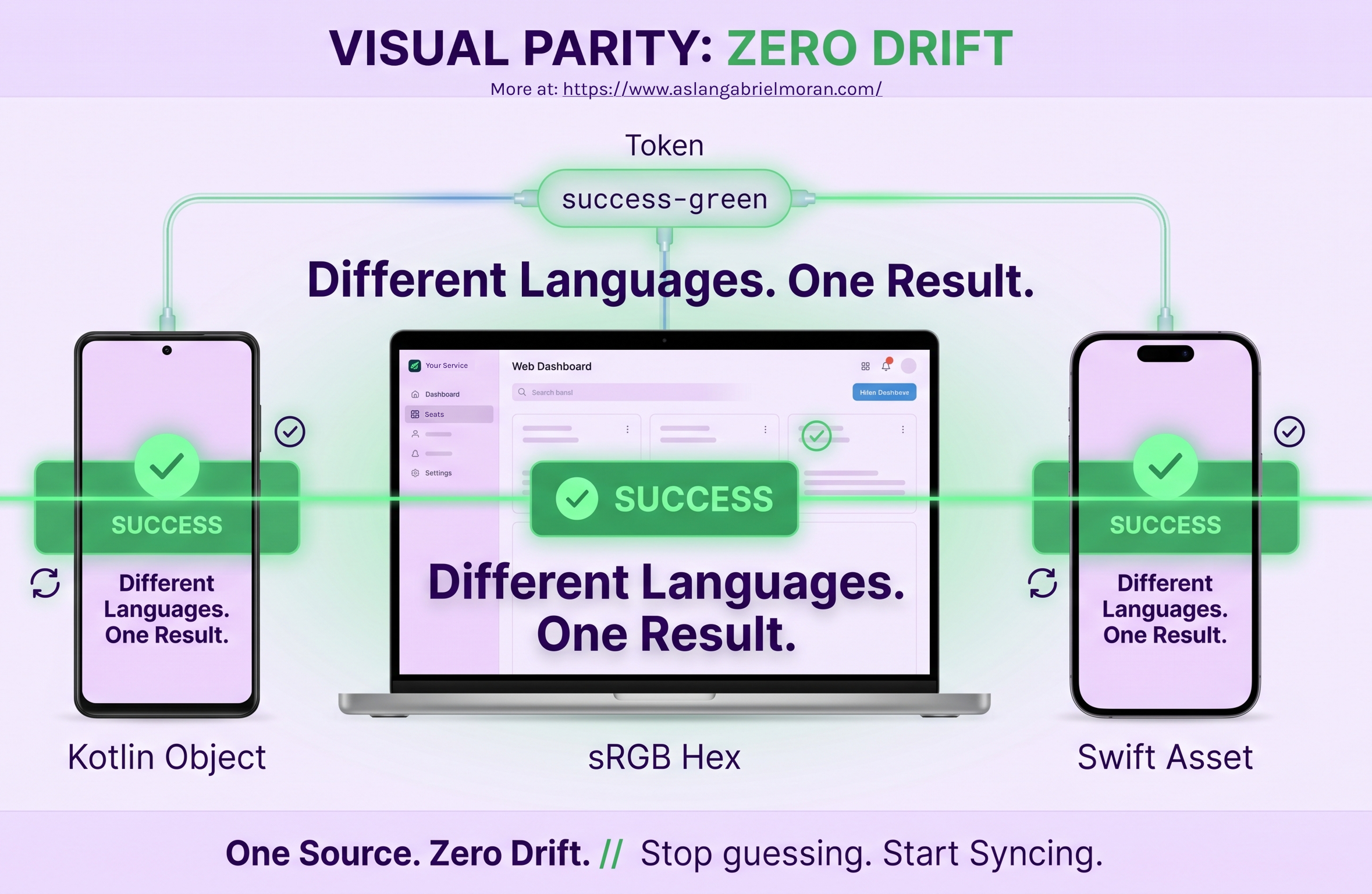
The problem is that Web, Android, and iOS all "speak" different languages:
- Web: renders colors via sRGB hex codes in CSS.
- Android (Compose): expects specific Colors objects in Kotlin.
- iOS (SwiftUI): uses Asset Catalogs and specialized Color initializers.
If you are manually entering these values in three different places, you’ve already lost the battle for consistency.
The Solution: One Source of Truth, Three Automated Pipelines
We don't aim for "close enough." We architect for mathematical parity.
Our process ensures that your brand remains immutable:
- The Source: We define the color logic in a platform-agnostic token.
- The Translation: Our pipeline automatically converts that token into the exact format each platform requires (Hex, Kotlin Color, or Swift Asset).
- The Result: Your engineer doesn't "inspect" the design to guess the value. They simply call Theme.colors.successGreen.
Why this matters for your ROI
When you eliminate the "Translation Tax," you win back hundreds of engineering hours. You stop the back-and-forth Slack messages asking, "Is this the right shade of green for the Android build?"
We build the architecture so your engineers can stop being "color detectives" and get back to building the core functionality of your SaaS.
One decision. Three platforms. Zero drift.
Ready to sync your product across every screen? Submit our Design System Intake >> form